After purple, will we be heading towards black?
By definition, what is dangerous climate change? Dangerous to whom? By when?
When do risks and impacts become intolerable?
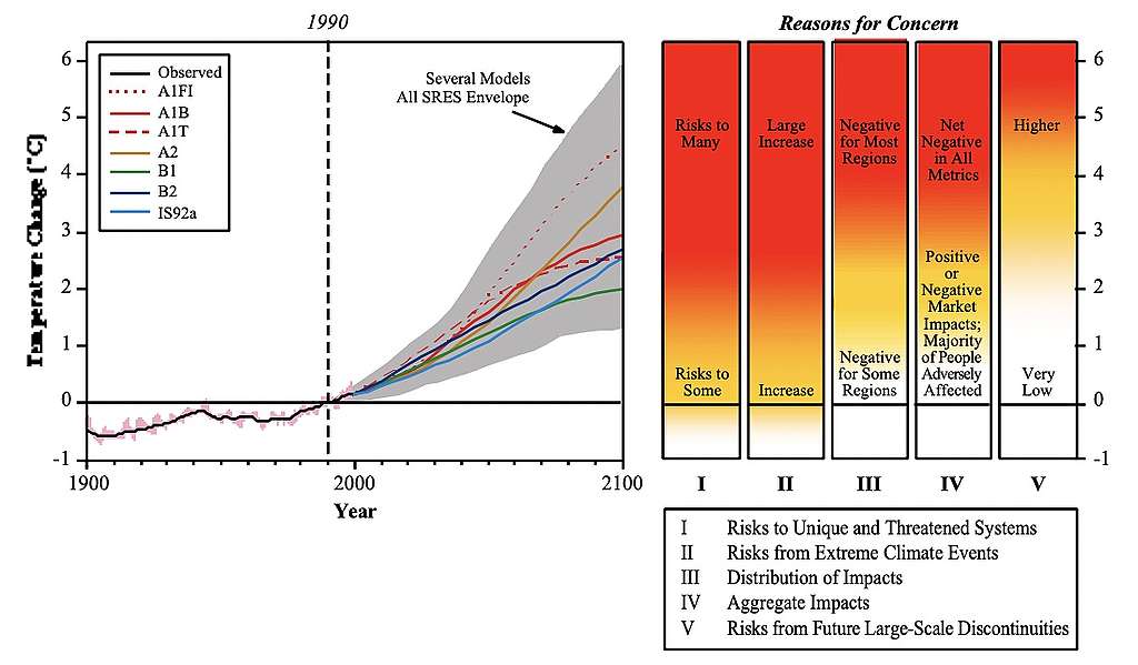
To answer these questions, scientists have developed, originally for the Third Assessment Report of the Intergovernmental Panel on Climate Change (IPCC) in 2001, a diagram that would illustrate, in one color-coded graph, their overall assessment on how global risks and impacts increase as temperature increases.
The graph, named Reasons For Concern, soon became better known as "The Burning Embers".
In the graphs scientists divide different climate-related risks into five pillars, or five Reasons For Concern (RFC), each measuring different aspects of aggregated climate risks.

The definitions for those pillars are described as following:
| RFC1 | Unique and threatened systems | Risks to ecological and human systems, such as coral reefs, the Arctic and its Indigenous People, mountain glaciers and biodiversity hotspots. |
| RFC2 | Extreme weather events | Impacts to human health, livelihoods, assets and ecosystems from extreme weather events such as heatwaves, heavy rain, drought and associated wildfires, and coastal flooding. |
| RFC3 | Distribution of impacts | Aggregated risks/impacts that disproportionately affect particular groups, such as vulnerable societies and socio-ecological systems, including disadvantaged people and communities in countries at all levels of development, due to uneven distribution of physical climate change hazards, exposure or vulnerability. |
| RFC4 | Global aggregate impacts | Impacts to socio-ecological systems that can be aggregated globally into a single metric, such as monetary damages, lives affected, species lost or ecosystem degradation at a global scale. |
| RFC5 | Large-scale singular events | Relatively large, abrupt and sometimes irreversible changes in systems caused by global warming, such as ice sheet disintegration or thermohaline circulation slowing and sometimes called tipping points or critical thresholds. |
How it started vs. how's it going…
Back in 2001, when the IPCC first used this tool, they assessed that with 2°C risks would overall remain rather moderate: they wouldn't yet turn high, except gradually for unique and threatened systems.
However, in their next iteration eight years later (2009), more embers were already on fire! According to improved understanding, 2°C could no longer be considered safe by any means.
By the next round, 2014, a whole new color was introduced to the graph, purple, to even better communicate the deepening reasons for concern.
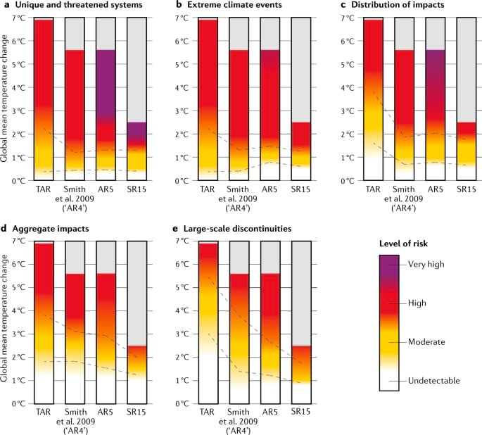
At each iteration, the IPCC has assessed risks and impacts to become higher at earlier warning levels.
Zommers et al (2020) illustrates this by comparing the evolution of the pillars from TAR (2001) to the 1.5°C Special Report SR15 (2018). Notice how purple enters the picture, and the point at which risks turn from yellow (moderate) to red (high) at earlier temperatures for each pillar.

The most striking change since TAR (2001) has been with the fifth pillar (RFC5). In 2001, the IPCC still assessed that the temperature at which risks associated with large-scale singular events (such as ice-sheet collapse) would become high at around 5.5 °C. By 2018 (in their 1.5°C special report) the risk assessment had changed profoundly: the risk was now assessed to start turning high already below 2°C, following new findings in climate science.
This was explained, among other things, by new evidence about ice-sheet loss during the last interglacial period at no more than 2°C average global warming above pre-industrial. By now, observations suggest that the West Antarctic Ice Sheet is already in the early stages of marine-ice-sheet instability.New findings about the slowdown of the Atlantic meridional overturning circulation, the El Nino-Southern Oscillation and the role of the Southern Ocean in the global carbon cycle also contributed to the finding that risk levels at lower temperatures had increased.
So what does the Sixth Assessment Report say about this?
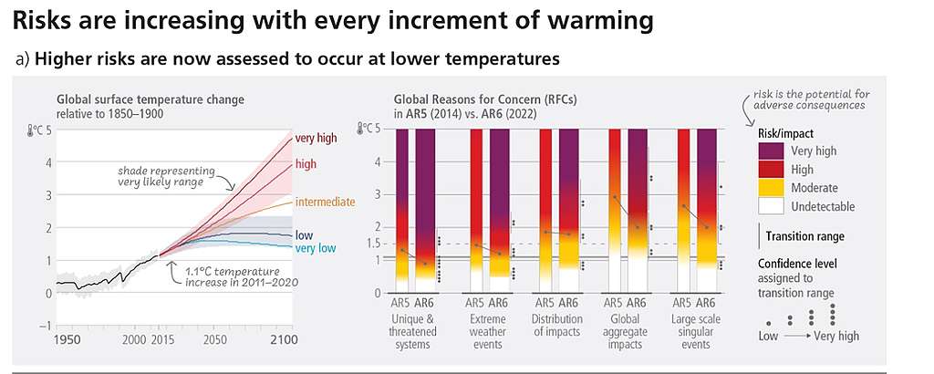
The 6th Assessment Report has updated the burning embers again. And it's not good news.

Compared to previous reports (AR5 and SR15)
- risks increase to high and very high levels at lower global warming levels for all five RFCs
- transitions from high to very high risk now emerge in all five RFCs, compared to just two in AR5
- transition ranges are assigned with greater confidence
Furthermore, in relation to 1.5°C warming, the AR6 (Working Group II) concluded that:"Limiting global warming to 1.5°C would ensure risk levels remain moderate for RFC3, RFC4 and RFC5 (medium confidence) but risk for RFC2 would have transitioned to a high risk at 1.5°C and RFC1 would be well into the transition to very high risk (high confidence).
In other words:
- overall risks and impacts turn to high faster than anticipated before
- Even 1.5°C isn't safe. Risks related to extreme weather, and to unique and threatened ecosystems will be high or transitioning to very high already then.
That is… Painful.
Towards high and very high risks
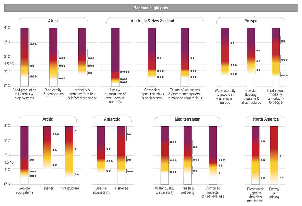
The IPCC additionally uses the color coding to assess specific risks to specific issues and systems. For example with warm-water corals, we're already transitioning to the high-risk zone with just 1.1°C where we're at now..

Or as one prominent IPCC scientist summed it up in twitter: "Corals are pretty much f-d."
According to a recent study safe havens for coral reefs will be almost non-existent at 1.5°C of global warming.
If we are to protect what's left to protect in marine life, we really need to stay as far below 2°C as humanly possible. And it's not looking great for the other ecosystems either.
And those pillars for different regions? Check it out.

So, what to think of all this?
It's not just the embers anymore that are burning. It's our future that's on fire.
So we better make sure that our governments and all industries, investors and cities do take that 1.5°C warming limit seriously.
And let's truly grasp the messages scientists are trying to convey by painting the colors darker and darker: it's serious. We're crossing limits.
When we lose corals, we don't lose just the corals. Coral reefs are home to more than a fourth of all marine life, providingfood, income and shoreline protection to coastal communities around the world.
Just let that sink in for a moment.
Then turn your pain and anger into action.
Show that you've heard the message, by sharing this news and committing to act on science.
#IPCCisAboutMe
Kaisa Kosonen is a Senior Policy Advisor with Greenpeace Nordic.


